Logitech Combo Touch Case Review
Logitech have now created a version of the Combo Touch keyboard case for the largest sized 12.9” iPad Pro (also available for the 11” Pro and 10.9” Air). This version features a full size keyboard, wide trackpad and it's £129 cheaper than Apple’s Magic Keyboard case. Priced at £199, such a significant saving will no doubt be alluring to prospective purchasers. So we’ve pitted the two against each other to determine which hybrid tablet/notebook solution is worthy of your iPad’s attention.
Design
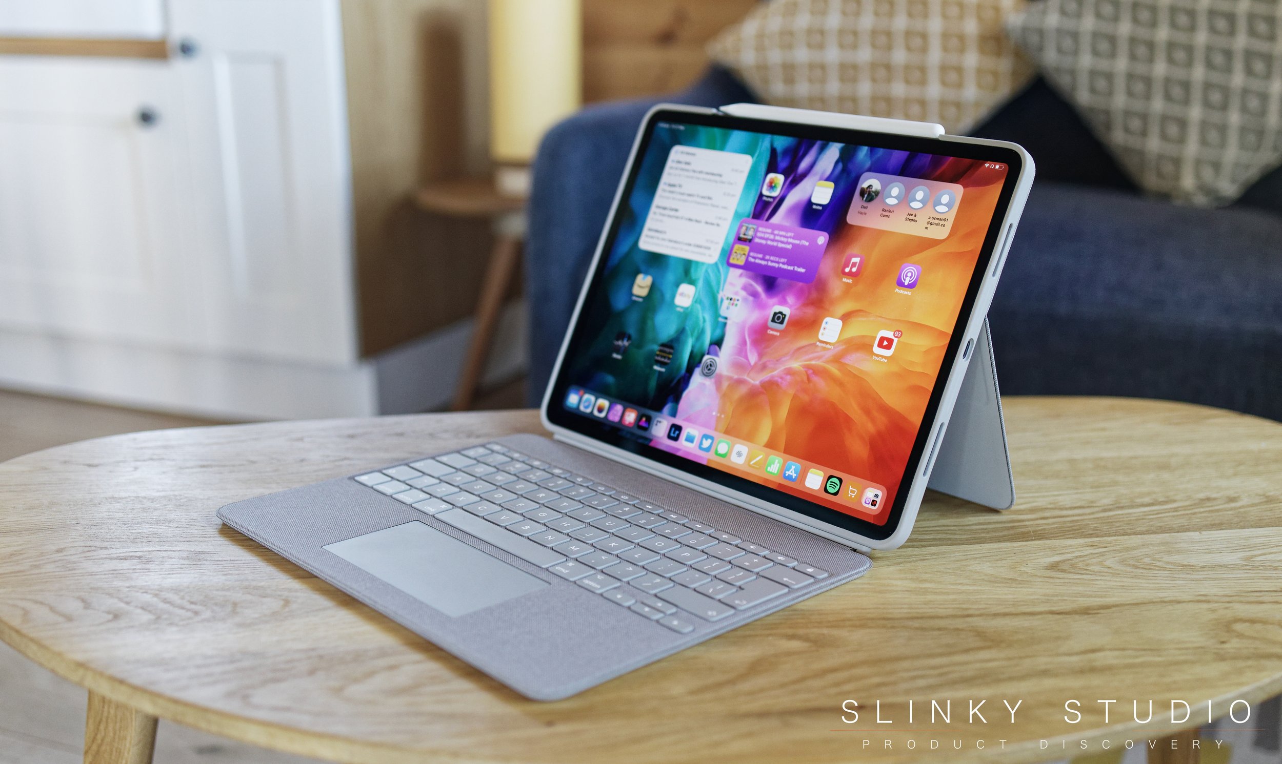
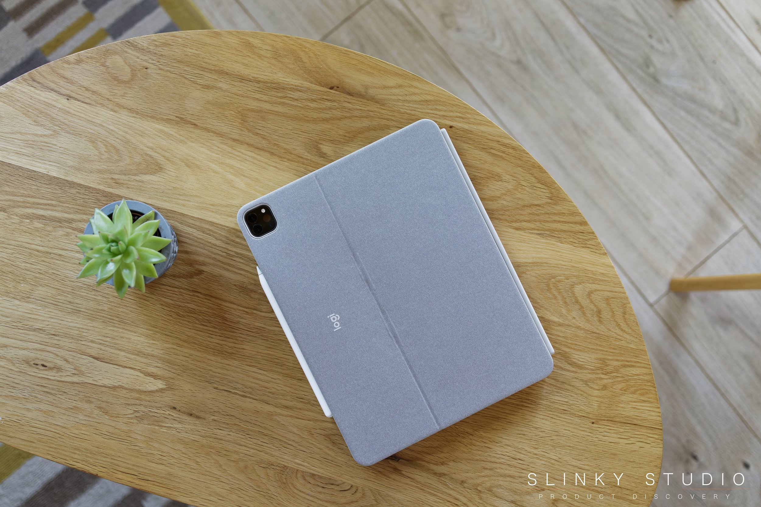
Unsurprisingly the Logitech Combo Touch draws many parallels with the Apple Magic Keyboard Case. It boasts a full sized chiclet styled keyboard, slightly wider trackpad and it doesn’t require any batteries to operate, thanks to it using the wireless Apple Smart Connector (no Bluetooth here). Where things depart from the Apple take on the hybrid notebook formula, is with the case material. Logitech opted to use a woven fabric finish, and with over a month of daily usage under the Logitech’s belt, it dawned on us that it hadn’t required any cleaning and looked and felt exactly as it did when it came through our door. Now the same certainly cannot be said for the soft touch material Apple have used on their case, which requires frequent weekly cleaning due to it getting greasy and the fact it is overly prone to static dust attraction.
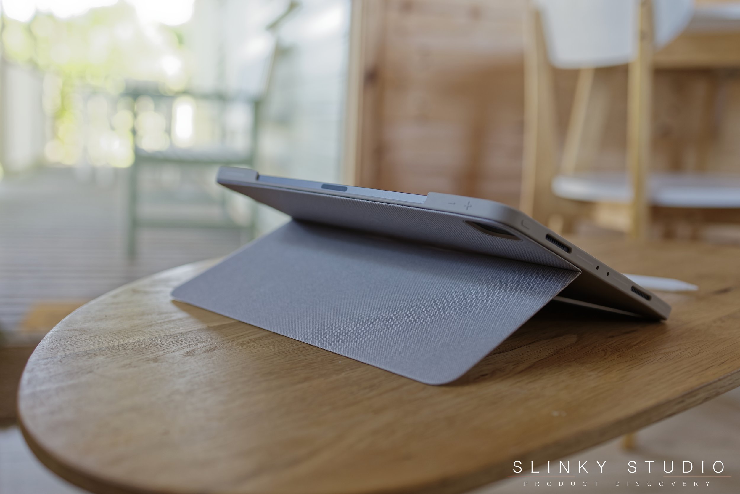
Where the literal standout difference between these two cases presents, is in the way the Logitech Combo Touch keyboard case props itself up. Apple offer a stand-free cantilever design with double loaded hinge, that was and continues to be an impressive synergy of form and function. Logitech have taken a different path, instead of clever hinges the Combo Touch requires a flip out stand to prop the iPad up. This seemed like a regressive design choice initially but, after racking up dozens of hours using this case, it is more of a mixed picture. It has the obvious downside of being less straightforward for immediate use and takes up more desk space, but exhibits many positives which the Apple version lacks. One being that the rigidity of the case body is less than that of the Apple Magic Keyboard Case, yet it’s this very characteristic which makes using it on your lap a perfectly acceptable proposition. Despite having a kickstand, which we had assumed would make such a scenario tricky, it turns out that it props itself up over, or on, your knees firmly because the stand doesn’t easily move, allowing for flexibility of the display tilt position. This also pushes the display further away from the keyboard than with the Apple version, making it a more similar experience to that of using a notebook computer. When using it within a typical desk/table formation, it’s nice to be able to push the display further back than with the Apple case, but then the touch display interaction is hindered and doesn’t feel quite as natural because it’s no longer elevated like it would be in Apple’s version.
The keyboard section can be magnetically removed with a vigorous pull and the iPad comes away left in its silicone shell. This shell does offer comprehensive protection, a cutout for the Apple Pencil and the flip out stand provides a variety of angled viewing options in its independent state, which the Apple case cannot (particularly nice for illustration Apps). Anyone with a 12.9” iPad Pro will know it’s a behemoth in size for handheld usage, so having additional grip provided by the fabric finish of the case is somewhat advantageous.
Keyboard & Trackpad
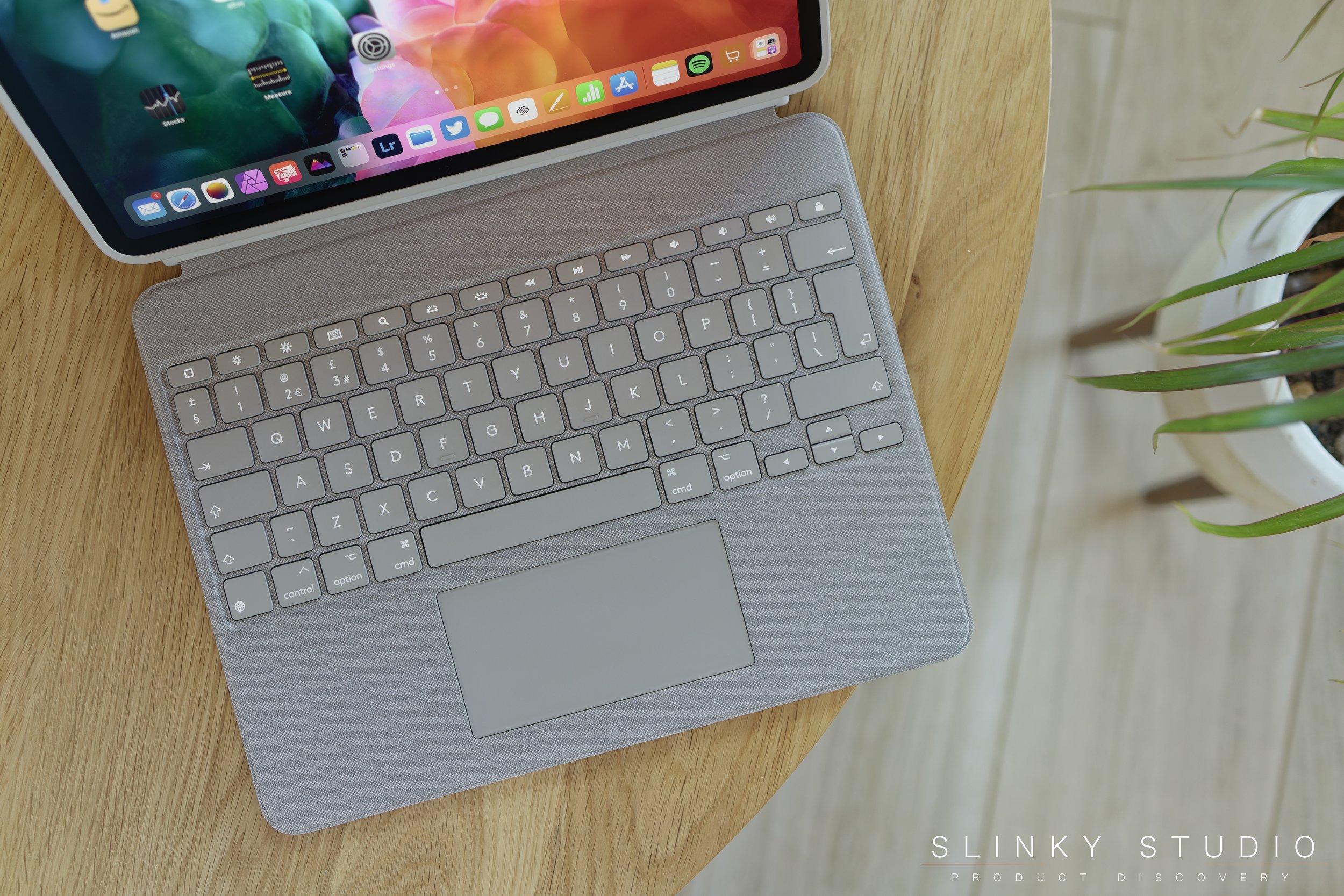
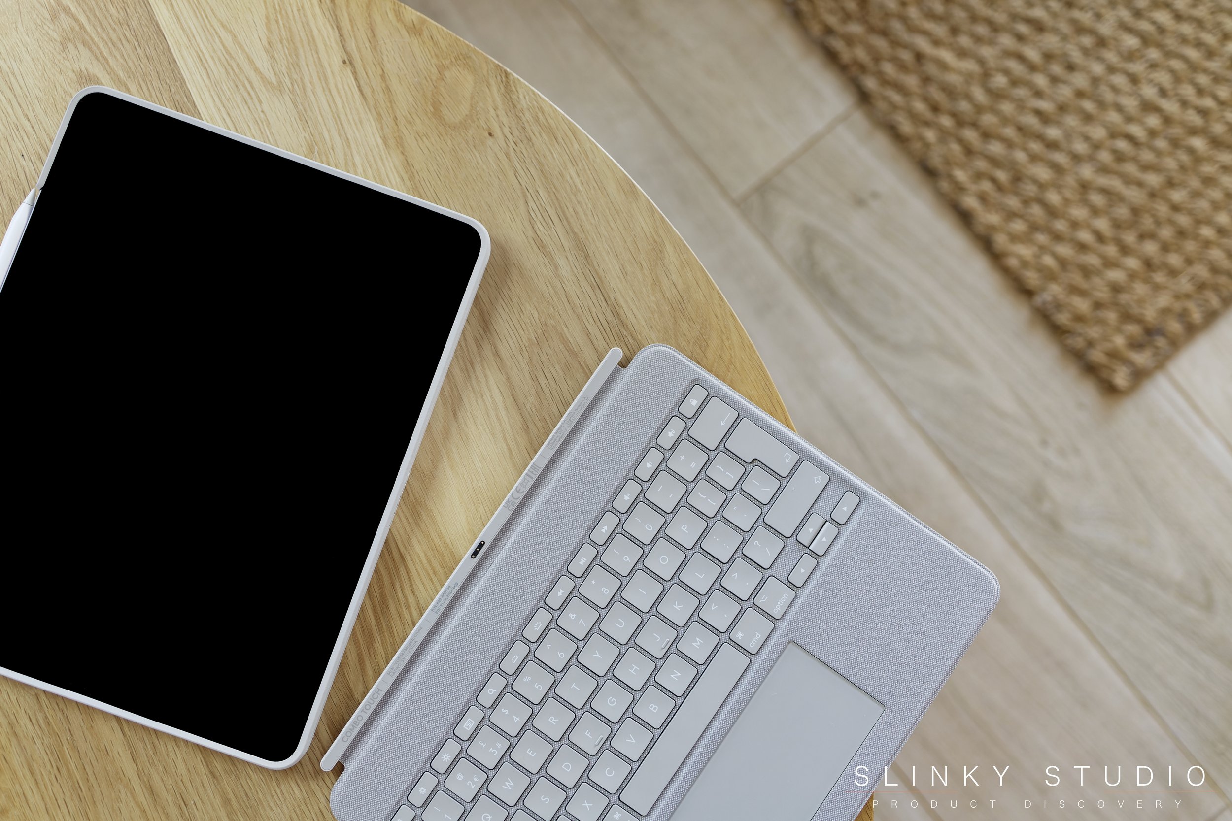
Logitech’s chiclet qwerty keyboard is excellent and offers crisp feedback with every key stroke. It feels closer to using a scissor-switch MacBook mechanism, and that’s a big positive. This is because there’s slightly more key travel than with the Apple Magic Keyboard Case, hence we also noticed we make less typos when using it. When it arrived, the woven fabric finish did leave reservations around comfort as to where the hands would rest on a textured surface whilst typing, but in actual fact it is on a par with Apple in this regard and, after racking up hours of continuous usage typing, it hasn’t attracted any thought to it being an issue. Additionally, there’s a row of function keys featuring the MacBook familiar display of brightness, keyboard backlight brightness, volume, media controls, search, home and sleep/wake. Every key below this is identical in function and layout to the Apple spread and the backlighting gets plenty bright for typing in darker environments.
When hopping between this and the Apple Magic Keyboard Case it became very evident that the larger trackpad on the Logitech Combo Touch of 6x12cm, vs 5x10cm on the Apple version, makes a significant difference. Multi-touch gestures are far easier to execute, the entire surface is clickable and general cursor usability is more ‘MacBook-like’. What’s more, the case operates 1:1 with the iPad via the smart connector, so the trackpad has no lag or quirks that the smattering of other third party keyboard cases have suffered with. It feels less compromised and more full featured because of the size. Unlike other areas of the Logitech case, where there might be more haze in difference, the trackpad has definite superiority to the one on the Apple Magic Keyboard Case.
Verdict
Without more ado, we’d recommend you save yourself the £129 and get the Logitech Combo Touch over the Apple Magic Keyboard Case when focusing on the key attributes that make a case like this a tablet/notebook fusion: namely, the keyboard and trackpad. Logitech have got both right. The larger trackpad makes the whole experience more pleasurable and more like a MacBook, and it’s a smidgen easier to type on thanks to greater key travel. The function keys we found indispensable. It’s a case that can be used both on desks and laps with its fold out stand. It’s not as ostentatious as the Apple Magic Keyboard Case or as rigid in concept. The Logitech choice also provides more flexibility when it comes to viewing angles with or without the keyboard attached magnetically. The only obvious drawbacks are the added bulk to the iPad and the slightly lessened touch screen experience due to it being pushed further back and lower down in this design.

